
Griiip is a complex motorsport platform built around real-time racing telemetry. Its core purpose is to transform highly technical race data into clear, understandable, and visually structured experiences for different audiences - from casual viewers to highly engaged fans.
The overall product ecosystem included:
applications for racing teams and drivers (training and race analytics),
an admin panel,
a marketing website,
presentations and video materials.
However, the business-critical core of the system consisted of two tightly connected products: Second Screen and Race Graphics.
Second Screen is a web application used by viewers during live races. It provides deeper context and additional layers of information, such as live leaderboards, race maps, charts, and interactive voting. The product supported both pure fan engagement and betting-assisted decision scenarios.
Race Graphics is a system of UI components and data visualizations shown directly during TV broadcasts. Its role is to explain what is happening on track in real time and to help viewers understand strategies, position changes, and potential outcomes.
The platform was initially launched for DTM racing series and later adapted and scaled to other racing series, each with its own rules, race formats, and telemetry structures.
My role focused on designing UX and UI for both core products, with a strong emphasis on data visualization, interaction patterns, animation logic, and building scalable design systems under strict broadcast constraints.
Overall design approach
Motorsport events produce large amounts of real-time data, but most of the strategic context is hard to understand during a standard TV broadcast due to limited space and very short attention windows. The challenge was to add interactive depth without overwhelming viewers, increase fan engagement during live races, and design a scalable system that works across different racing series. Success meant making complex data understandable within seconds and creating a second-screen experience that complements TV rather than duplicates it.
The UI and visual design of Griiip was approached as a cross-platform system, not a set of isolated interfaces. The same live telemetry data needed to be expressed across two very different environments:
TV broadcast, where attention is fragmented and time-to-read is extremely limited
Mobile / web second screen, where more information can be shown, but only if it meaningfully complements the broadcast
My focus was on structure, hierarchy, and interaction logic rather than visual decoration.


Second Screen App
Second Screen - designing density without duplication
Second Screen was the primary tool for information depth. Its main challenge was fitting a very large amount of live data into a mobile-first interface, while ensuring that it genuinely extended the broadcast experience instead of repeating it.
Key UX challenges:
extremely limited screen real estate on mobile devices,
multiple data types competing for attention (leaderboards, maps, charts, voting),
constant live updates during the race,
parallel usage with TV (second-screen context).
Design principles applied:
progressive disclosure: overview first, details on demand
clear separation of concerns: each screen had a single primary purpose
strong hierarchy: the most time-sensitive data always visible first
contextual depth: secondary insights available without leaving the race flow
Second Screen was intentionally designed to answer questions that TV could not:
Why did a position change happen?
What strategy options are emerging?
How does this compare across drivers or laps?
This ensured that the second screen experience felt additive rather than redundant.


Other projects
web3
crypto
AI
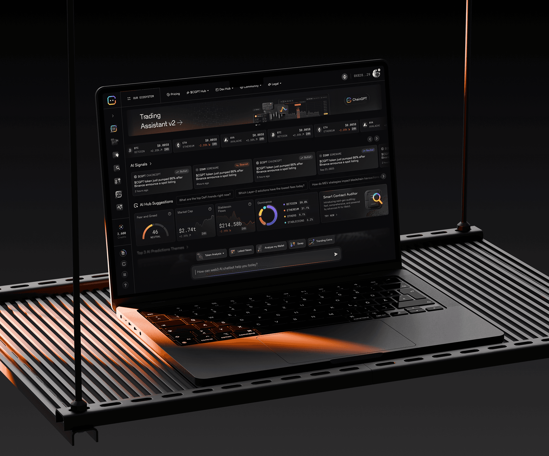
ChainGPT AI Hub
Chat-centered architecture enabling scalable AI tool growth and monetization evolution
web3
crypto
AI
ChainGPT AI Hub
Chat-centered architecture enabling scalable AI tool growth and monetization evolution
Personal finance
Fintech
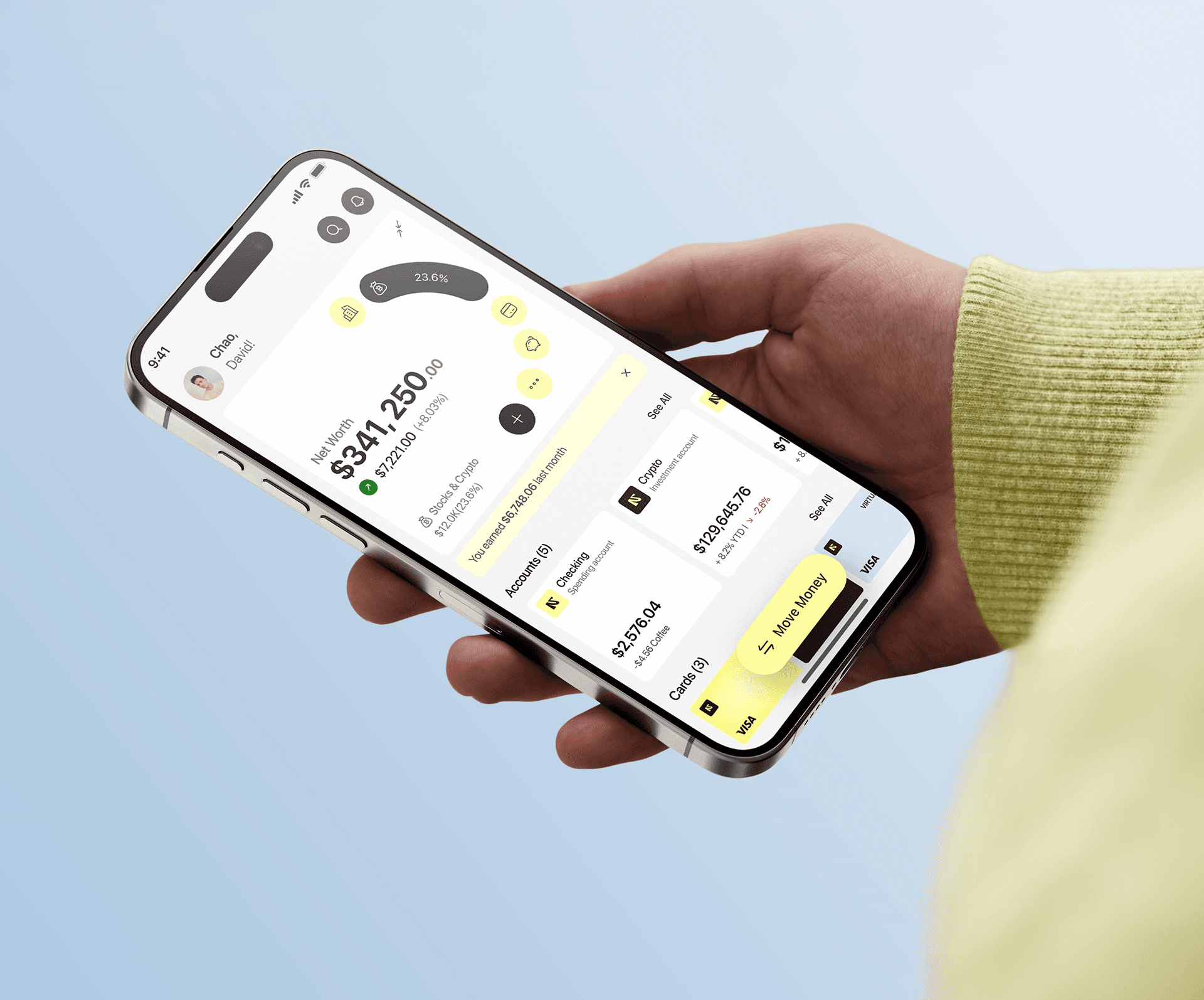
Normies App
A scalable foundation for a complex financial product, covering money management, investments, assets, automation, and social finance
Personal finance
Fintech
Normies App
A scalable foundation for a complex financial product, covering money management, investments, assets, automation, and social finance